Last year when the PWHL’s first draft of team names came out I wrote something shall we say…opinionated, about the rumored branding choices. Now that the team names are official, it’s time for the riveting sequel.
I do find it very interesting that we get team names before we get even a whisper of news about the PWHL’s gender inclusion policy, but alas, I digress. Onto the logos!
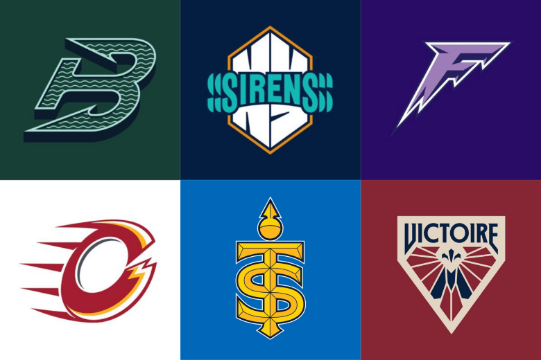
Boston Fleet
I like this logo. There’s a definable thought at work and a clear reference to Boston’s nautical history without hitting the viewer over the head with it. I like the wave pattern and the shape is fun. I can see it being an anchor or a fishhook, although the official word is anchor.
A closer look at our logo. pic.twitter.com/j8csA57wIm
— Boston Fleet (@PWHL_Boston) September 9, 2024
As for the name, Fleet is a brand of enema. I’ll leave it at that.
Minnesota Frost
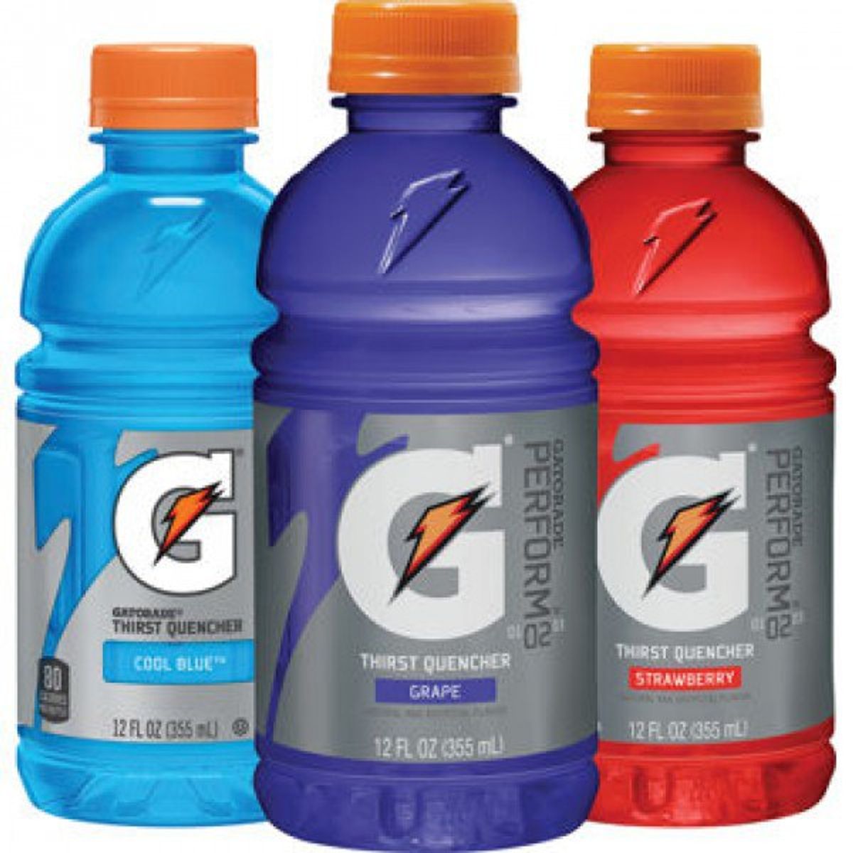
Welp, they yassified Gatorade. I’m all about adding more purple to pro sports, but my god this feels generic. It doesn’t even look like ice: it looks like lightning! There’s no excitement or character here, just a logo you could find in any high school sports equipment catalogue. As for the wordmark, it looks like a bootleg direct-to-video “Thor” sequel. Love and Frost, perhaps?
Montréal Victoire
My favorite of the bunch. I enjoy the art nouveau vibes and how they incorporated some blue in without retreating to Habs colors. I find this logo distinctive, elegant, and a touch retro without feeling dated.
#NewProfilePic #NouvellePhotodeProfil pic.twitter.com/rVSeVA77js
— Victoire de Montréal (@PWHL_Montreal) September 9, 2024
New York Sirens
Does anyone else see a TARDIS? Just me? Okay.
This is really the best they could do for sirens? Y’all’ve (yes, you read that right) had a year and change to get this right, and the end result is, to paraphrase some of my colleagues, “that S thing I used to draw all the time in middle school.”
Ottawa Charge
I’m a big believer in women’s sports teams marketing themselves separately from the men’s teams in their city (with the exception of the Calgary Inferno, because that was easily the best logo in North American history), so while I’m glad the Charge isn’t trying to be the Senators, did no one on the myriad committees stop and see the Flames imagery?
Congratulations to the Cleveland Cavaliers and the Calgary Flames on their new child! https://t.co/GoHlvkh0rn pic.twitter.com/Oyf78wnO5d
— Julio (@JulioHashem) September 9, 2024
Which is worse: going purposefully towards a men’s team in your city, or accidentally going towards a team in a different part of the country?
Toronto Sceptres
I’m not bothered by this. Now, not being bothered by something isn’t the same as liking it, and as such, I feel a bit let down here. There’s so much to play with in terms of the royalty angle, but all I can see is the logo for Taylor Swift’s new Major League Baseball venture. Give us diamonds, give us rubies! Stop trying to be sleek and lean into it.