Happy Hockey Friday! Melissa Burgess here from The Ice Garden. As the PWHL season grows nearer, more and more pieces are falling into place. This week, the league unveiled the inaugural round of jersey designs for the four expansion franchises — and I’m here to grade them, naturally.
The four teams — in Detroit, Hamilton, Las Vegas and San Jose — will sport these jerseys for season one. As is standard in the PWHL, each jersey features the city’s name diagonally across the front. Team monikers and logos are still to be unveiled, but won’t appear on the inaugural season jerseys.
Bright, bold colors and a whole lot of stripes seems to be the name of the game for this round. Let’s take a closer look.
Help shape what’s next for The IX Sports! Take our short reader survey:
PWHL Detroit
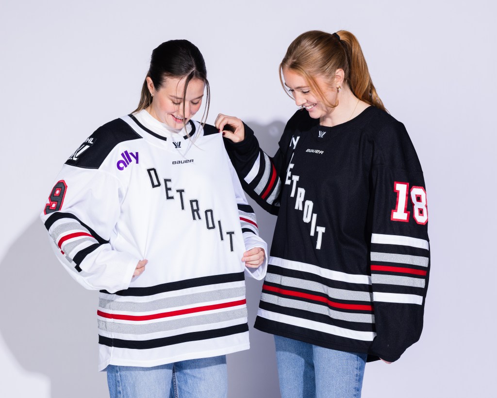
Do you like stripes? How about more stripes? If so, PWHL Detroit’s jerseys are perfect for you. The jerseys feature black, silver and red, which is an elite color combination in my opinion. It hints to the city’s “Motor City” moniker without being too in-your-face about it! The league said the color trio of white, silver and red stripes “are a callback to Detroit’s 313 area code,” but I’m not sure I understand the relation there. At any rate, the colors are great.
That said, it seems like half of the jersey is stripes, and it’s … a lot. You could’ve taken off half the stripes at the bottom and had a much cleaner look. Detroit’s jersey also features the ally Financial sponsor patch, since they have an affiliation with the team. If we need to have a sponsor patch, could we at least consider putting it in the team’s color scheme?
Overall grade: B+
Listen now to The IX Sports Podcast and Women’s Sports Daily
We are excited to announce the launch of TWO new podcasts for all the women’s sports fans out there looking for a daily dose of women’s sports news and analysis. Stream on Spotify, Apple Podcasts or anywhere you listen to podcasts, and make sure to subscribe!
PWHL Hamilton
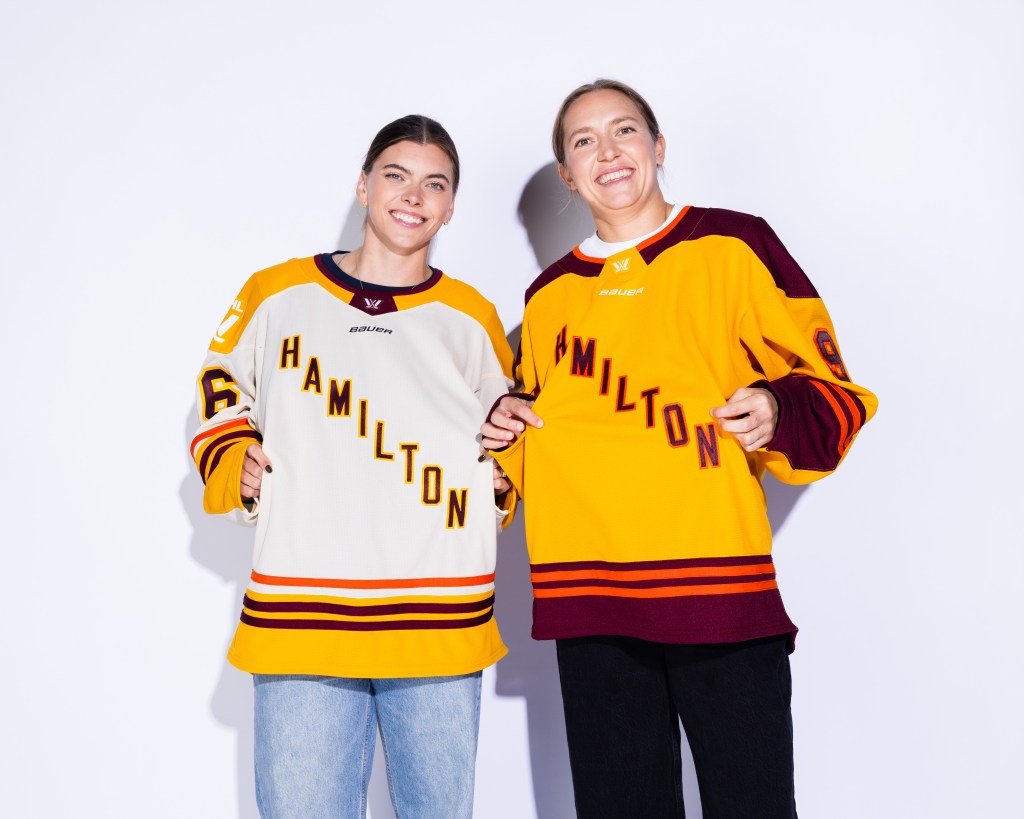
Those gold jerseys are VERY gold, aren’t they? There’s nothing subtle about this look, and its color scheme is uniquely Hamilton, an homage to teams like the CFL’s Tiger-Cats, the OHL’s Bulldogs and NHL’s Tigers.
Of the two, I don’t terribly mind the cream-colored jersey. The striping at the bottom feels awkward and unnecessary. I feel like nowadays, every hockey jersey HAS to have stripes and I don’t know why. Cut the stripes and make it cleaner.
The overall look for the gold jersey, with the deep red gloves and pads to match, evokes that of the Minnesota Golden Gophers. It’s a little too close.
Overall grade: B–
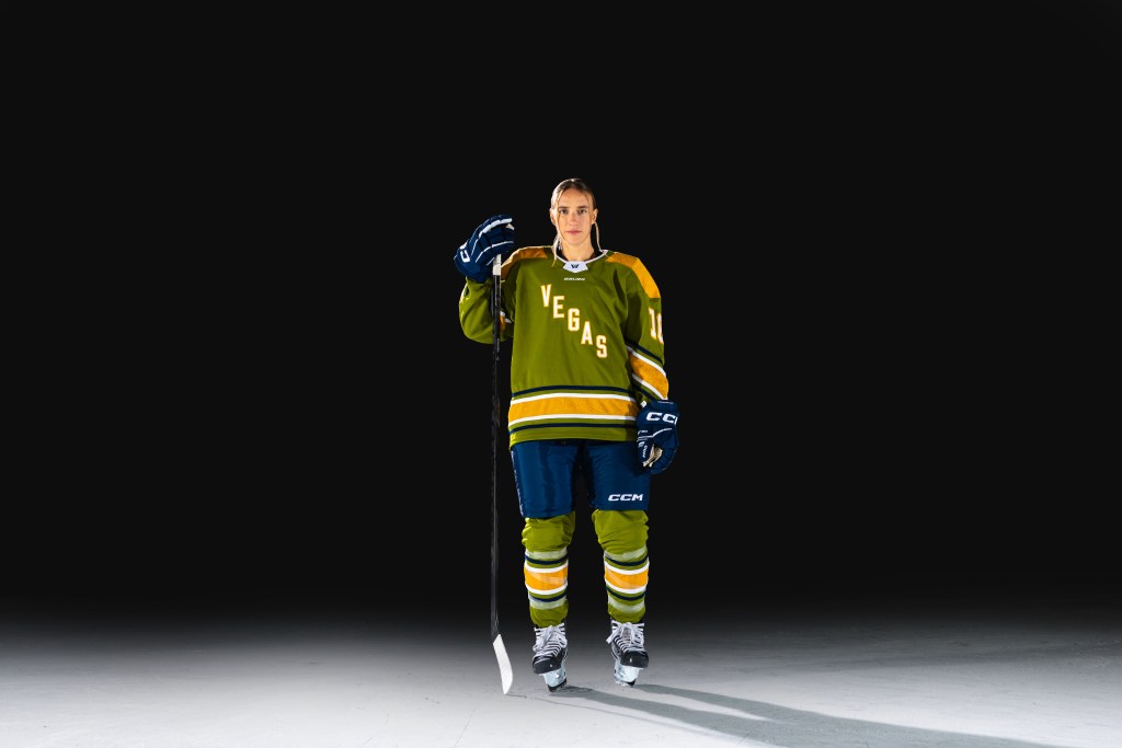
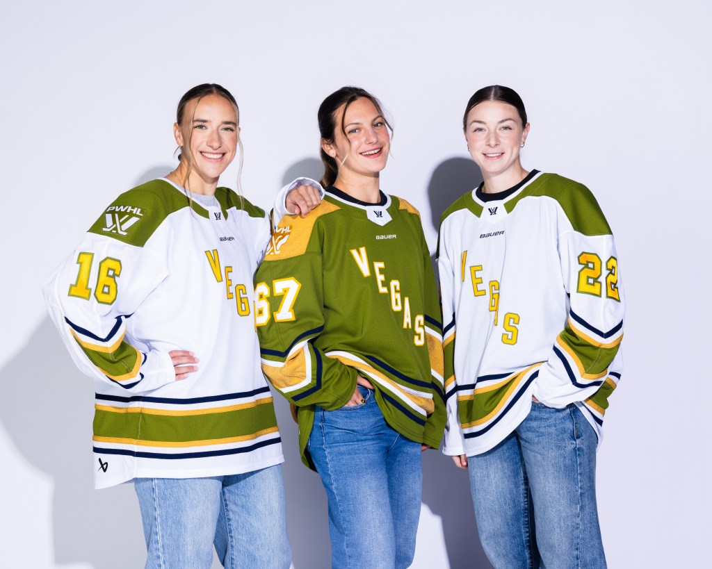
PWHL Las Vegas
Las Vegas’ color palette of green, gold and navy is certainly a unique combination. I don’t think a lot of people like this shade of green very much, but when you think about the desert, it’s the shade that makes sense. (That said, I think a darker cream/very light brown could’ve worked beautifully here!)
The navy just feels very out of place to me. Maybe you could’ve slotted in the darker cream or very light brown there, instead, and it may have worked well. It’s played as a “nod to the desert at night,” but the sky literally anywhere at night could be considered navy blue – so it’s not inherently unique in that sense.
I don’t mind the striping on the sleeves here; it’s not straight across, so it provides a little more shape and movement. I could do without the stripes on the bottom, including the very thick gold stripe, but it feels less obtrusive than others.
Overall grade: B-
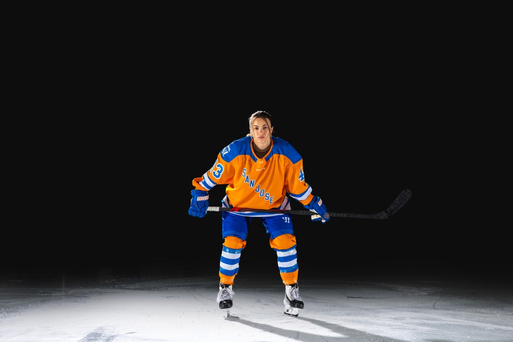
PWHL San Jose
ORANGE you glad these jerseys are so bold? The PWHL’s first California-based team is really going for it with this look, and I love it. Per the league’s release, this is the first time Bauer has produced a jersey with orange as a team’s primary color.
The one thing I will note here is that in some photos, the orange appears almost yellow. As such, when you look at the white jerseys quickly, they look sort of similar to the Toronto Sceptres’ white jerseys.
You can’t really see the striping on the bottom of the jersey in the above photo, and it looks clean without it! That said, I think the striping is fine because it helps break up the very, very bright orange that is the rest of the look.
Overall grade: B+
Other news in women’s hockey…
A look at PWHL Hamilton’s training camp invites by Natalia Rachman
Breaking down PWHL San Jose’s training camp invitations by Eli Fastiff
2026 Top 25 Under 25: Caroline Harvey (#1) by Emma Sullivan
PWHL Mailbag by Melissa Burgess
Way-too-early Patty Kazmaier Award 2026-27 watchlist for NCAA hockey (NCAA)
She’s on two Division 1 teams at Boston College. How? (The Boston Globe) ($)
Rep The IX Sports at your next game!
Shop the logo collection or special “Women’s Sports are Front Page News” collection now on Shopify.

Soccer: Annie Peterson, @AnnieMPeterson, AP Women’s Soccer
Tennis: Joey Dillon, @JoeyDillon, Freelance Tennis Writer
Basketball: Howard Megdal, @HowardMegdal, The IX Sports
Softball: Maren Angus-Coombs, @Maren-Angus, The IX Sports
Golf: Marin Dremock, @MDremock, The IX Sports
Hockey: @TheIceGarden, The Ice Garden
Gymnastics: Jessica Taylor Price, @jesstaylorprice, Freelance Writer