
Editor’s Note: This story is brought to you by TIG guest contributor LJ Bachenheimer. You can follow LJ on social media here.
Have you ever picked a team to root for just because you liked their jerseys? I’m guilty as charged, and I know I’m not the only one. As silly as it may seem, deciding your team allegiance based on aesthetics is a perfect example of why a team’s jersey design is so important. And when it comes to jersey design in hockey, I have a lot of opinions.
The NWHL/PHF had a lot of good jerseys during its existence, but also a lot of mid-level jerseys and a couple of bad ones. Let’s take a journey back through the jersey history of the previous North American women’s professional hockey league by highlighting and explaining my favorite and least favorite jerseys from each franchise.
For simplicity’s sake, I’ll only be considering regular-season home, away, and third jerseys, so that means no special event jerseys. The style and methodology of this jersey review are heavily borrowed from the now-inactive blog Hockey by Design, but the opinions are all my own.
Boston Pride
Let’s get this jersey journey started with the three-time Isobel Cup winners from Beantown. The Boston Pride had a clean, classic aesthetic that often utilized traditional hockey design elements in their striping patterns and even their black and yellow color scheme. Their lioness head roundel logo was striking and recognizable, serving as an effective symbol of the team. My favorite Pride jersey, however, is the one that perhaps most pushed the boundaries of hockey aesthetics.
The Pride debuted this unique design during the 2021 Lake Placid bubble season and eventually went on to win their second Isobel Cup that year, with this jersey being memorialized in all the championship photos.

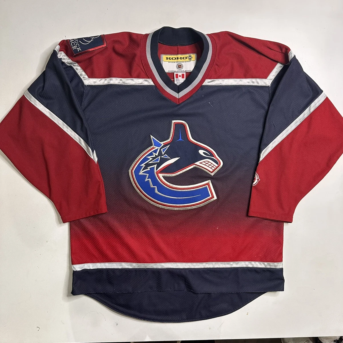
It’s iconic, and for good reason. When this design was first announced, I was skeptical, worrying that it would call back a little too much to the NHL’s disastrous experiments with gradients in the ’90s (looking at you, Vancouver Canucks, LA Kings, Pittsburgh Penguins), but it quickly won me over.
The black-to-gold gradient is striking and well-executed, standing out whenever the Pride was on the ice. The two thin stripes on the arms are a subtle touch, adding a little more traditional hockey design, while the shoulder patches are a big win. I love that they worked the lioness head from the team logo in there.
My one critique of this generally awesome jersey is the main logo. I’m not a huge fan of the big flat “BOSTON” wordmark across the chest. The font is fine as far as wordmarks go, but I feel like it leaves a lot of open space on the front of the torso. Aside from that, this jersey is well-designed and eye-catching enough to stand out on the ice and off it.
On the flip side of the unique gradient jerseys is my least favorite Boston Pride jersey, which served as their inaugural NWHL threads. This is a much more traditional design, but it also suffers from a less-than-great wordmark logo.

I want to clarify that I don’t think this is a bad jersey — it just doesn’t work for me, and the logo is a big part of that. I have mixed opinions on wordmark logos in general. I think it’s hard to have a defined visual identity when your logo is just text. This is one of those cases. The claw mark in place of the “I” was an attempt to spice things up, but it just looks awkward. Especially knowing of the great lioness head logo they later implemented, the wordmark is disappointing.
The rest of the jersey is fine. I’m glad that the drop shadow present on this mockup wasn’t put on the jerseys because there are very few cases where that style works, and there’s not enough contrast between the white shadow and yellow background here to make that design choice effective. The striping pattern, especially paired with the yellow base, is very Boston, looking like something straight out of the Bruins locker room. I like the black shoulder yoke to break up the wash of yellow, and laces are almost always a plus, but that’s about it. The wordmark logo spoils an otherwise decent jersey.
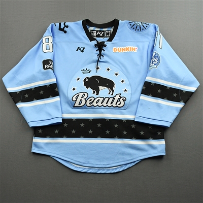
Buffalo Beauts
Did the Buffalo Beauts have the best color scheme in hockey? I’d be willing to field that argument. Their sky blue is such a lovely color on its own, and it works great as both the focal point and accent color of a jersey. The Beauts had a handful of uniform variations during their time in the NWHL/PHF but few misses, which made picking a favorite and least favorite quite difficult! For the team from the Queen City, I want to highlight their season seven third jersey.
A throwback to a history that predates this specific team — a “faux-back” jersey of sorts — this sky blue stars-and-stripes look debuted at the 2022 “Buffalo Believes Classic” outdoor game.
It carried on the tradition of outdoor games going for retro jersey designs, with the logo and striping on the arms inspired by the Buffalo Bisons hockey team jerseys of the 1930s and the stars on the shoulders drawing from the Beauts’ own 2017–18 NWHL jerseys. Putting a bunch of stripes on a jersey has a long history in hockey, dating back to the sport’s earliest days. As such, it’s a common choice for creating a retro look, but the execution can vary wildly. Sometimes you get a cool look, and sometimes you get the Montréal Canadiens’ barber poles.
Luckily for the Beauts, they nailed it. By sticking to only three colors, with their lovely shade of blue as the focal point and black and “vintage white” serving as accents, the stripes on the arms read as effective, not excessive.
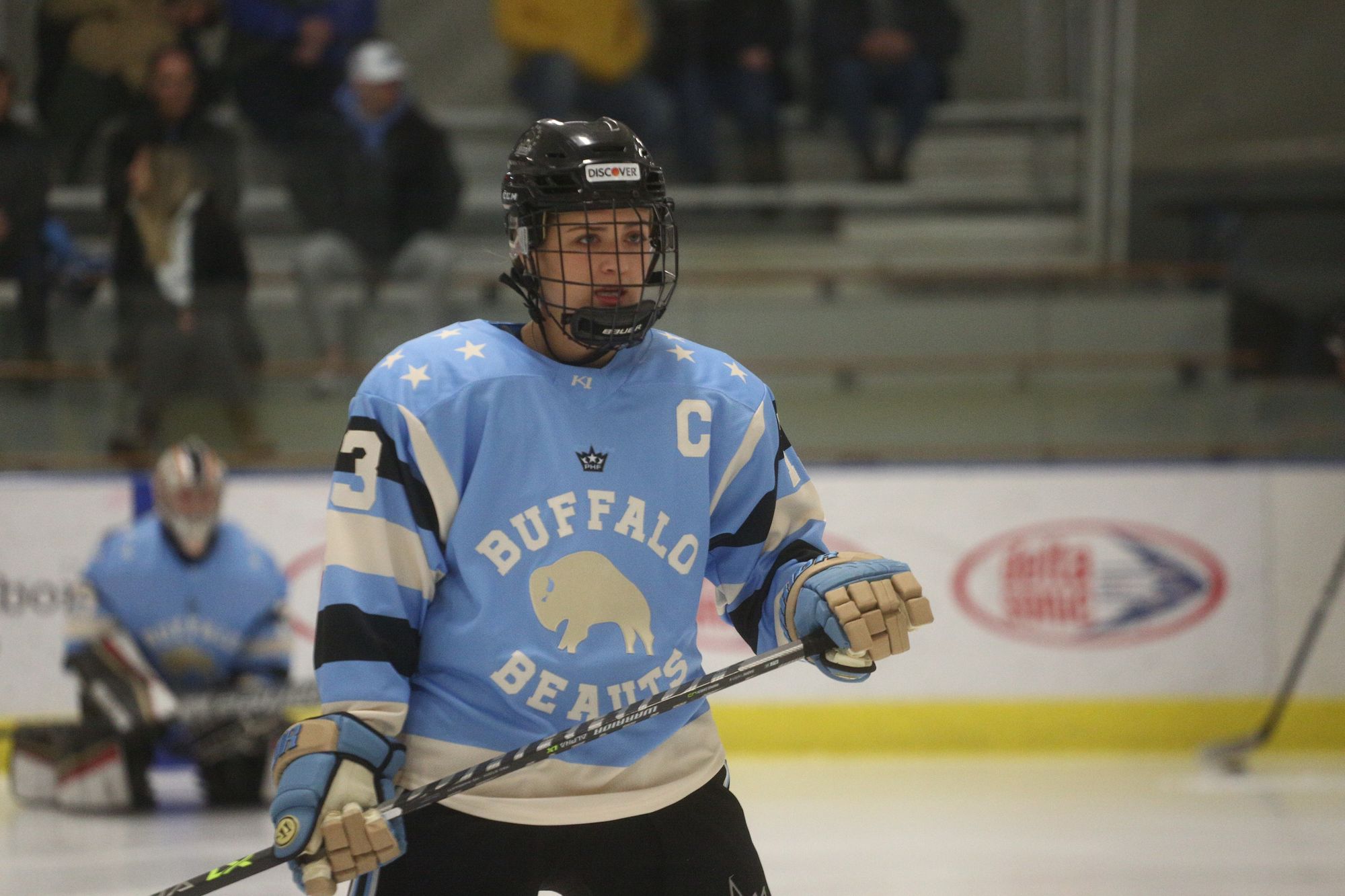
Also crucial to the success of the arm stripes? The number placement. It would be so easy for the numbers on the arms to get swallowed in a mass of color, but by setting them in white over the three-stripe set of blue-black-blue, they’re readable and help to maintain visual consistency. The chest logo isn’t anything particularly special, but it’s effective. I can’t put my finger on it, but I enjoy the shape of the little buffalo. It’s just working for me.
The font is fine. I have no particular critiques of a standard athletic block serif, though the placement of the text surrounding the buffalo is pretty good. I don’t dislike the stars across the shoulders — I think they’re fun and playful — but from a pure design standpoint, they’re probably unnecessary. There’s enough going on visually without them. The white strip along the bottom is also in that category. The Beauts wear black pants, so they don’t have to worry about irritating me with the bottom of the jersey and the pants being the same color. In general, this was a great special event jersey, and I’m really glad that Buffalo brought it back as their third jersey.
As I said earlier, it took a lot of work to pick a least-favorite jersey because of the consistency in style and quality from Buffalo. However, their inaugural NWHL jersey is the lowest ranked in my books because of the general lack of that iconic Beauts blue.

I don’t like a gray jersey. Gray is generally bland and not a great color for hockey, a sport played on a white sheet of ice where it’s likely the other team is wearing either black or white. There are so many fun colors that would look better on a jersey, so why not use them?
Then we get to the actual design elements of this uniform. I kind of like the look when the sleeves are a different color than the torso (my Wisconsin Badgers men’s hockey team does it), and the three arm stripes are a classic hockey look. I actually kind of like the way the blue, white, and gray stripes look together.
But the thing that’s grinding my gears about this jersey is the shoulder yoke. I don’t like the shape of it. It’s somewhere in between rounded and squared off in a way that I don’t enjoy. Not to mention, the black shoulder yoke is the same color as the black sleeves, but the shoulder yoke is marked off by a thick blue and thin white stripe, which just looks awkward. The designer of this jersey should have chosen either the shoulder yoke or the contrasting sleeves, because having both muddles the design.
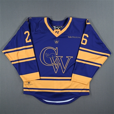
Connecticut Whale
Out of all the original NWHL teams, the Connecticut Whale was visually poised to be a crowd-pleaser. With their name, colors, and aesthetic inspired by the Hartford Whalers, the former NHL franchise beloved for their jerseys and logo, the Whale had a great foundation to build on.
Their logo is simple but effective, with a classic sports C pumped up with the addition of a cute little cartoon whale. Much like the Whalers’ famous hidden H, the Whale logo has an Easter egg too, with a small hockey stick forming the whale’s smirk. For the most part, the team from the Constitution State was consistent with their visual identity, keeping similar jersey templates while swapping around the arrangement of blue, green, and white. My favorite Whale jerseys are their season six aways, with the perfect balance of color and some fun design touches.
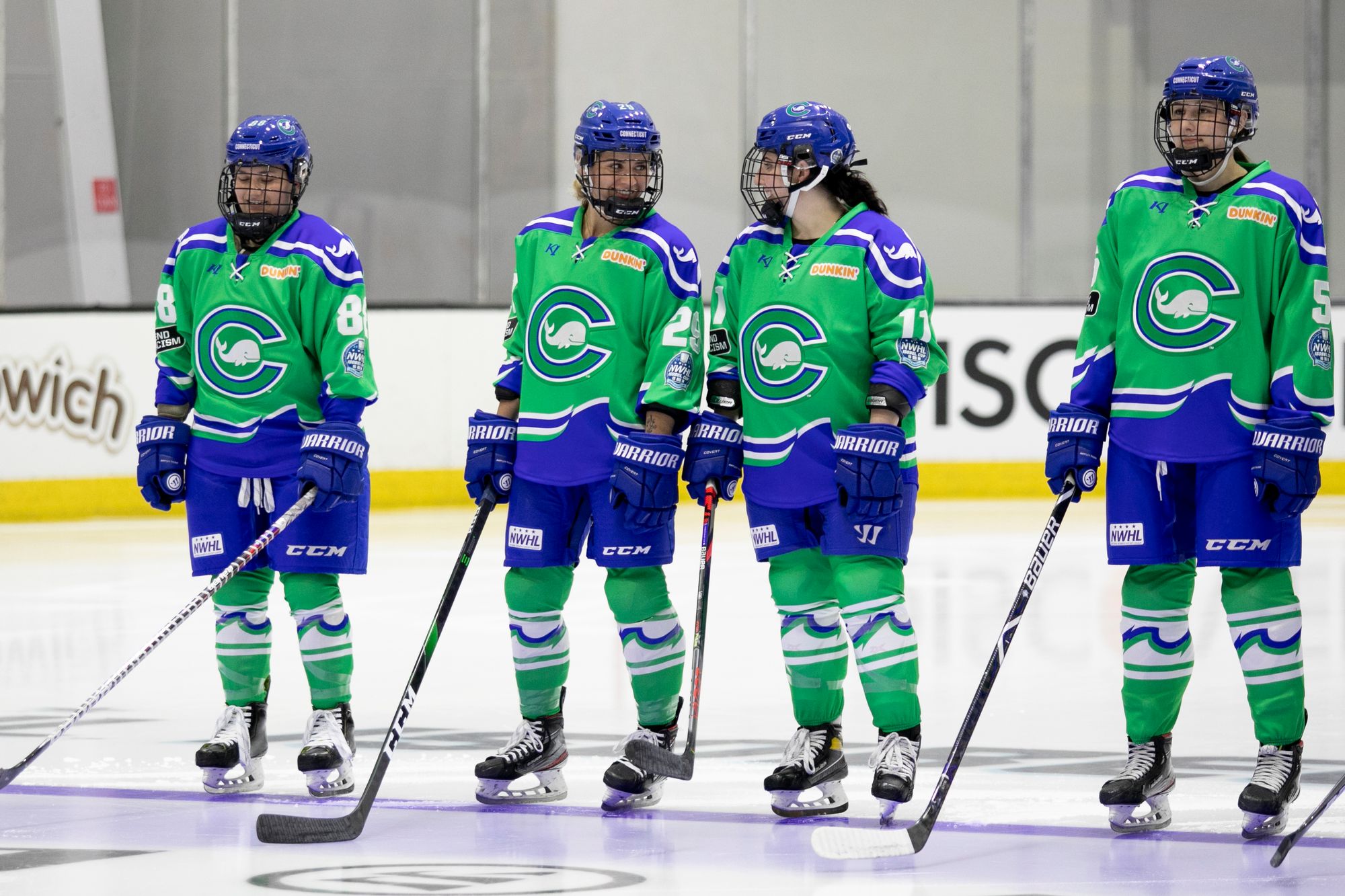
The Whale had white and blue jerseys before, but I think they looked best in green. It’s a vibrant shade that stood out among the other teams of the PHF. Having a green base also allows the blue and white accents to pop, and on this jersey, that’s especially fun. I adore the bottom third of this design, featuring a blue area demarcated by textured stripes imitating waves. New York Islanders, eat your heart out: this is the best implementation of waves on a hockey jersey that I have ever seen.
I specifically appreciate that the wavy stripes are carried onto the sleeves as well, creating some nice visual consistency and perhaps even evoking a whale tail. The rounded shoulder yoke is another dash of blue implemented well, adding a more traditional element of hockey design to the experimental components, and the whale works as a shoulder decal.
I have only two small gripes about this jersey.
First, I wish the C in the logo was blue rather than green so that it would stand out more. Second, it’s a pet peeve of mine is when the bottom part of a hockey jersey is the same color as the pants. I find that it looks odd and muddled, especially when watching on TV. Unfortunately, the Whale fell into this problem with their season six away uniform, but it’s not a deal-breaker. Overall, this is a visually interesting and effective jersey and one of my all-time favorites out of all the NWHL/PHF uniforms.
In an unfortunate turn of events, the Whale’s worst jerseys were the ones they wore during their best season. My least favorite jerseys out of Connecticut were their season seven set. Both jerseys used the same template, just with swapped colors, so I’m going to talk about them together.

The first thing I thought of when these jerseys were revealed ahead of the 2021–22 season was that the decals along the hem and cuffs looked like clip art. Especially compared to the wavy striping in my favorite jerseys the season before, this design felt like a downgrade. Where the vibrance of the Whale’s team colors had previously been a strength, it’s now a weakness, emphasizing the cartoonishness of the wave and the whale tails on the arm.
I actually think the whale tails are a fun touch, I like how the shoulder yoke tapers to a point, and I appreciate that the color of the C contrasts with the base of the jersey. But those elements, and the performance of the team that wore them all the way to the Isobel Cup Finals, are not enough to salvage the design for me.
Metropolitan Riveters
I’ll finish up my analysis of the NWHL’s Founding Four with the team that went through the most changes to its visual identity. The Metropolitan Riveters had been classic and modern, red and blue and white, with different logos and patterns creating many different iterations of jerseys both good and bad. The Rivs look I want to highlight comes from Season 6, with their navy blue home jerseys.

I appreciated the switch to a blue-focused look after a few years of red jerseys. The aviation-inspired blue and white away jerseys that were paired with these are also a favorite of mine, but I think this design just pulls together a lot of elements effectively.
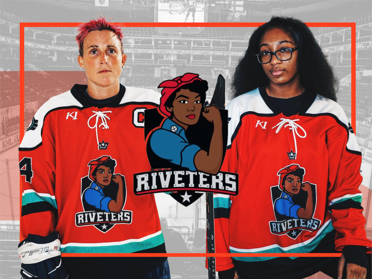
Red as an accent color works well here, tying everything together nicely with the right placement on the accent stripes and shoulder yoke. The Rosie logo is iconic in all its iterations, from the classic Rosie to the newer “steel Rosie” to Black Rosie, and it looks fantastic on merch and the ice. The striping pattern is very classically hockey, with the three-banded stripes on the arms and waist plus a simple shoulder yoke with blunt edges, much like the older jerseys from the New Jersey Devils, the Rivs’ former NHL partner team.
But, what amps that pattern up to awesome levels is the little rivet design on the white stripes. Some NHL teams have played around with patterned striping before (the Carolina Hurricanes, for example) with varying degrees of success, but usually those failed because they got too complicated. In comparison the Rivs kept it very simple, with the little circular rivets adding a nice design element without being overwhelming.
They have done the rivet detailing before on some of their previous jerseys, but I particularly enjoy the subtlety of gray rivets on a white stripe. Plus, the rivets on the shoulder yoke tied the element into the jersey design. The last little element is the stars on the sleeves. Are they necessary? Not really. But in my opinion, they don’t detract from the design at all and they add a little extra character.
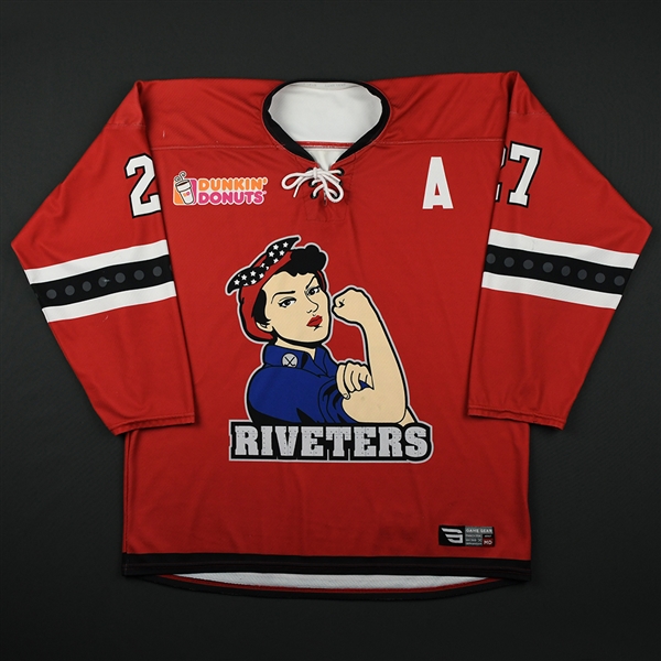
Once again, my least favorite jersey is one from the first season of the NWHL with some small, unfortunate design decisions. The original New York Riveters jerseys are busy and representative of a team that was still figuring out its identity.

For starters, the main logo. I know I just said that Rosie is iconic in all forms, and she is, but I dislike the way the New York Riveters’ logo had to fit her into a shield. As shown on my favorite Rivs jersey, Rosie is a strong enough visual to stand on her own. The shield background is also needlessly complex, with a two-tone navy blue and red pattern. One solid color would not be ideal, but two colors are unnecessary. With that gripe aside, I don’t hate the general template of this jersey. It’s quite similar to my top pick, with the three-banded stripes with rivets, shoulder yoke, and stars on the sleeve cuffs. But the use and placement of color make a big difference.
I generally don’t enjoy the Rivs in white (their 2021–22 white jerseys are also one of my least favorites). Navy blue and red over white just don’t mesh as well, especially because the cuffs on this white jersey are navy. I also don’t like the way the rounded shoulder yoke looks here; a squared-off one might have looked more cohesive. Part of my distaste for the shoulder design might also be a result of the shoulder patches. I have no particular qualms about national flags, but I’m not a fan of reusing the Rosie logo (with the shield, unfortunately) on the other side. It’s not a simple logo and so it gets muddled when shrunk onto a shoulder patch, it becomes muddled. Instead of another Rosie, the shoulder patch would have been a good place for a more simplistic secondary logo, or even just another flag. I’m glad that over their many jersey designs following this one, the Metropolitan Riveters figured out how to make a clean, effective, iconic look for themselves.
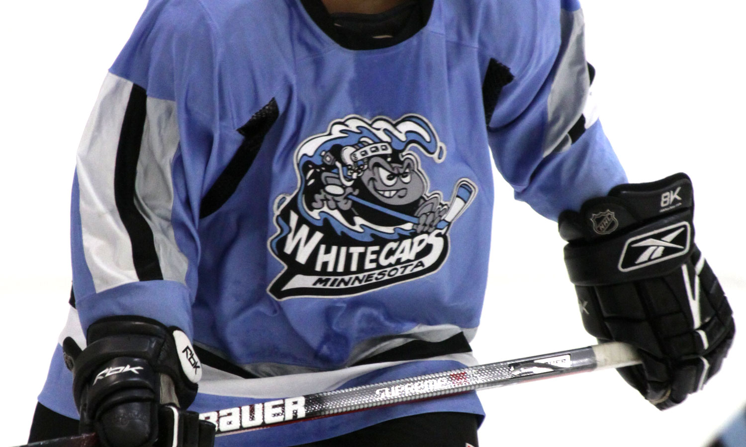
Minnesota Whitecaps
The Minnesota Whitecaps were a franchise with a lot of history, yet they were remarkably consistent with their visual identity during their time in the PHF. I want to give an honorable mention to the black jerseys with the patterned shoulder yokes that the Whitecaps wore for their first few years in the league. There’s a wrong way and a right way to do patterns on a hockey jersey, and the Whitecaps figured out the latter, especially because the pattern on the shoulder was mirrored in the full uniform on their pants. But when Minnesota broke the mold, they created what is probably my favorite NWHL/PHF jersey ever (and the only one I own).

Minnesota is known as the “Land of 1,000 Lakes,” and the team brought that moniker to life with the awesome lake scene that is the focal point of this jersey. The rest of the jersey itself is pretty simplistic, but that simplicity mixed with the fun detailing allows it to shine. The striping pattern is nothing particularly innovative — the Toronto Six used basically the same one on their jerseys — but that doesn’t mean I don’t like it. Simplicity or classic design elements aren’t necessarily a bad thing, and with the more out-there aspects of this jersey, it balances out.
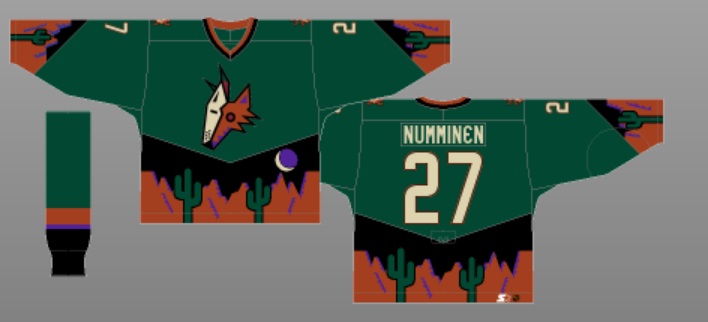
I do think the shade of blue for the cuffs is quite nice, though. Maybe I just enjoy a nice blue hue. Then there’s the true focal point of the jersey, the lake and trees scenery along the waist. The only jersey I can think of that’s done anything similar is an old Arizona Coyotes third jersey, but that was poorly executed if I’m being kind. The Whitecaps, on the other hand, nailed it.
The scenery is monochrome blue, which means it’s not too busy or visually jarring. In my opinion, it’s very pleasing to the eye. You can’t make out all the details when it’s being worn on the ice, but I don’t see that as a problem. In motion, the design just reads as a waist stripe, but it matches the nice shade of blue on the sleeves and so it all comes together. There’s a reason I’ve gotten compliments even from people who know nothing about women’s hockey when I’ve worn this jersey.
The Whitecaps didn’t wear that many jerseys during their time in the NWHL/PHF, which made it more difficult for me to select my least favorite. They did not have the same visual consistency before joining the league, though, so I’m going to offer dishonorable mentions to the original Cappy jerseys (I know it’s iconic, but it’s a bad logo) and the pre-NWHL black and gray gradient stripe jerseys (see my earlier rant about gray hockey jerseys). But if we’re sticking to the NWHL/PHF years, my least favorite Whitecaps jersey is their season seven home jersey.

Simply put, these jerseys are my least favorite because they’re boring, and that’s disappointing. Especially coming off the unique design and sheer visual interest of the lake jerseys, this look is a letdown. It’s a fine jersey, with the Whitecaps logo front and center, and two thick stripes — one black, one blue — along the waist and arms.
The Minnesota state outline and curly M are fine as shoulder decals, but I just wish there was something else here! Give me a shoulder yoke to break up the top of the jersey, or a second set of stripes on the upper arm, just pump it up a little more. It makes me sad that this was one of the last jerseys in the long history of the Minnesota Whitecaps.
Toronto Six
The NWHL/PHF’s first Canadian franchise didn’t have enough time to play around with their visual identity; the three jerseys they entered the league with were the only ones they ever wore. I have a clear least favorite, but for most favorite it was difficult for me to choose between their red home jerseys and black away jerseys, as they are essentially the same jersey color-swapped. My favorite of them might vary based on the day, but for now, the black away jersey is doing it for me.

It’s a simple jersey, with the isolated cuff set off by some thin-thick-thin stripes on the arms as the main design element. But the simplicity is effective, allowing the awesome Toronto Six logo to shine. Despite possibly looking like a unicycle, the T6 logo was carefully designed and packed a lot of symbolism into something unique and recognizable, so it makes sense to place it as the focal point of this jersey. The black jersey is also really good at balancing color, with the gold on the cuffs and red accents breaking up the black nicely.
The color balance is primarily why I picked the black jersey over the red one, where the red feels more overpowering. The shoulder patches are part of the red accents in this jersey, and while I like the placement of the Canadian flag, the “6ix” wordmark just strikes me as weird. It doesn’t quite fit on the shoulder because it’s a little too complex, and I just don’t like that wordmark design generally (the T6 logo doesn’t look like an S).
I’m also irked by the thin strip of gold that peeks out over the top white stripe on the arms, and I think the design would look cleaner without it. But other than those two small things, this jersey is a great example of why keeping it simple can be successful in hockey design.
The white third jersey, however, did not take cues from the other two, needlessly complicating an otherwise great jersey.
I do not like this jersey. That’s disappointing, because I would have loved it if this jersey had one less element. The major detractor here is the watermark pattern. I don’t know why the designers thought it was a good idea, but the silver leaves, stars, and “TORONTO” text layered under the logo, numbers, and stripes do not look good. It’s confusing and overly complicated. With the other two jerseys, the Six’s visual brand is sleek simplicity, but their white thirds are just clunky. The thing is, I love the six gold diagonal stripes, and the color balance between white, gold, and red is pretty good. But I just can’t get past the watermark. It’s another unfortunate example of one element ruining a whole jersey for me.
Montréal Force
The Montréal Force unfortunately only got one season in the PHF, so they never had a chance to fully develop their identity on the ice or make something memorable out of their aesthetic. La Force came in with three classic, effective jerseys, so a favorite and least favorite wasn’t obvious. Before I get into that though, I want to shout out Montréal’s Indigenous jersey, a beautiful design with vibrant colors and deep meaning created by a local artist. It’s one of the most unique and gorgeous hockey jerseys I’ve seen take the ice. Unfortunately, I’ve limited myself to focusing solely on regular-season home, away, and third jerseys, so my favorite is La Force’s black third jerseys.
I know I’ve already featured two other black jerseys as my favorites, but I generally don’t like black jerseys, funny enough. However, the Force thirds, like the Boston gradients and the Six’s set, use black effectively. The white and maroon team crest, as well as the fleur-de-lis shoulder patches and numbers, stand out well against a black base. I also like the four maroon stripes on the arm and waist, which are a different and nice look in contrast to the other Force jerseys. This jersey is so simple that I don’t have much more to say about it. Part of me wonders what Montréal would have done with more time in the PHF to refine its visual identity. I think I would have loved a Montréal Canadiens-style chest stripe jersey in Force colors … maybe someone with more artistic talent than me would want to take a stab at designing that hypothetical jersey.
By a slim margin, my least favorite from La Force is their maroon jersey. I like this jersey too, but (following a somewhat common thread in this article) it’s the little things that knock it down in my standings.
Once again, the little thing is a sublimated design. On an abstract level, I think the idea of a little fleur-de-lis pattern is kind of fun. It’s well-executed on the white jerseys, and the Beauts also successfully did sublimated patterns on their jerseys. But in both of those cases, that element was limited to a smaller area within the stripes of the jersey, not the whole base color. The pattern isn’t contrasting enough to see from afar, yet it looks odd and awkward when you’re paying attention to it. Other than that, this is a pretty good jersey. I love the shade of maroon that La Force made into a part of their identity, and making it the base of this jersey is quite nice. The striping pattern is a classic hockey design, which fits perfectly in a classic hockey city like Montréal. Especially considering their similar color scheme, I would be perfectly content if PWHL Montréal stole this design sans the sublimated pattern. Speaking of the PWHL …
What Can PWHL Designers Learn from the PHF?
With the sale of the PHF and a new pro women’s hockey league on the horizon, it’s highly unlikely we’ll ever see these jerseys on the ice again, for better or for worse. However, there are a lot of takeaways from the designs of the NWHL and PHF that the PWHL can learn from. Here’s what I’m hoping to see when the new league eventually releases their jerseys.
Bold Color
Especially in the later PHF seasons — once teams had real home and away jerseys — the use of color was really fun. Several teams opted for a bold light jersey instead of just white, which created a lot of visual interest. I love a good color-on-color matchup, and I hope the PWHL keeps up that trend, especially with some of the interesting hues the teams seem to be using. Imagine New York’s teal up against Ottawa’s red, or Boston’s green versus Minnesota’s purple.
Memorable Logos
The PWHL’s league logo was released recently, exhibiting a lot of symbolism but also feeling a little … bland. I want to see some fun, iconic team logos, with symbolism and local connection but also a level of recognizability. I’ve had people ask about or compliment the Riveters sticker on my water bottle or a Minnesota Whitecaps shirt because those are eye-catching, memorable symbols for a team. The same thing should happen when I’m representing my favorite PWHL team.
A Mix of Modern and Classic
I love how the teams of the PHF were often willing to push the envelope of hockey design, creating amazing and unique jerseys like Boston’s gradient or Minnesota’s lake scene. At the same time, they were able to draw on the traditions and standards of jersey design for more classic looks, like Buffalo’s retro thirds or Boston’s chest stripe yellows. I hope the PWHL can do the same. It’s hard to walk the fine line between innovative and excessive, but I also don’t want to see the new league just play it safe either. If they can work with both modern and classic jersey styles, the PWHL can set new standards for fun, iconic women’s hockey jerseys.
Fun Specialty Jerseys
I didn’t talk about them a whole lot during this jersey review due to my self-imposed rules, but the PHF teams had so many interesting and meaningful special event jerseys, from Pride nights; to awareness for a cause like mental health, cancer, or Alzheimer’s; to throwbacks (shoutout to the Whale’s Pittsburgh Pennies-inspired jerseys, probably my favorite jersey that I didn’t get to talk about here). No matter what the occasion was, these designs always had an equal amount of playfulness and passion. Especially with specialty jerseys eliminated from the NHL this season, I hope the PWHL can pick up the slack.
I’ve presented my favorite and least favorite jersey from each PHF team, but I’d love to hear everyone else’s takes. If you want to defend your favorite jersey against the “least favorite” title, share your own top and bottom picks, or theorize about what’s upcoming in jersey design from the PWHL, leave a comment or come find me on Twitter @leajamieb.