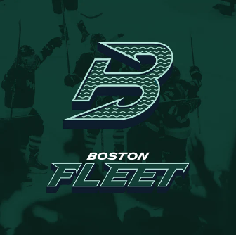
In the choice of name, logo, and color palette for Boston, it’s clear that the design team drew upon the region’s history both within and without hockey.
Name
As one of the biggest port cities in the northeast of the continent, Boston has a long nautical history. It’s been a center for commerce, migration, and warfare. Charlestown Navy Yard, cited by the PWHL’s Vice President of Brand and Marketing, Kanan Bhatt-Shah, as a point of inspiration for the design team, was where American fleets were built for nearly 174 years.
In terms of fitting the cultural heritage of the region, the name fits. As the name of a hockey team? A fleet is made up of many ships which must be coordinated to sail together. The word fleet means fast, a key component of hockey. It’s unusual because it’s a collective noun, but it’s not the first time that’s been done. In the smallest of ways, that aspect calls back to the Boston Pride of the PHF. The image changes from lions to warships, but the symbolism of the team as a collective remains.

The other Boston hockey connection for the name Fleet is the Fleet Center, the name of the Boston Bruins’ home rink at one point. Fleet Bank was eventually bought out by TD Bank, which brought back the Garden moniker that residents preferred. While probably not intentional, it is an interesting reference.
Colors
The original PWHL Boston dark green was perhaps best compared to the Boston Red Sox’s legendary Green Monster wall at Fenway Park, on a cloudy, maybe even snowy day. The Fleet’s new palette, as shown their latest graphics, is slightly bluer. The different shades put me in mind of such things as evergreen forests and the green of the ocean when you’re looking right down into it. Layered on top, the mint green looks electric—fast and powerful by itself, like a boat zipping over deep water, or a winter storm. The combination will look good on white jerseys, though I think the mint green by itself might be too much for a jersey base. Maybe in stripes for St. Patrick’s Day.
Repping our new logo just got easier… 😎#WallpaperWednesday pic.twitter.com/RYCiDfhDrf
— Boston Fleet (@PWHL_Boston) September 18, 2024
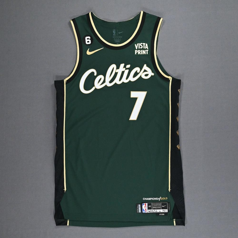
Other notable teams in the area that have used dark green as a color include the Boston Celtics, the Hartford Whalers and its various descendants, and Dartmouth College. But the Fleet palette is distinct from these. One jersey that does bear some resemblance is the Celtics’ 2022-23 City Edition jersey. The way the pale but very bright gold gives this dark green jersey an electric look may hint at what Fleet home jerseys will look like on the ice this fall.
Logo
As many have pointed out, the use of the anchor as the shape of the B for the logo is reminiscent of the Hartford Whalers logo. I don’t consider this a ripoff because both designs depart from the actual appearance of an anchor in ways that are their own. However, it does serve as an homage in the way that choosing green as the primary color is a nod, even though the greens are not very similar.

New England holds its history and its traditions very close. The saga of the Whalers still resonates. The Fleet name, colors, and logo, to allow for some metaphor, sails parallel to this history without cutting across it. It feels like this team has been set up well to honor the past and chart its own course.
Visually, the logo does a shockingly good job of capturing the concept of coordinated forward motion. The B appears to be moving slightly downwards and to the right with the spokes of the anchor serving as arrows to inspire the directionality. Thin wavy lines within it resemble many parts working together to make a whole, while also providing the obvious ocean waves motif. Even the three-dimensionality provided by the dark shadow under the B grants a solidity like a real object in motion.

Summary
The PWHL’s Kanan Bhatt-Shah explained part of her design team’s ethos to the Ice Garden: “One of the criteria for considering the names was really, how will this name come to life visually, in a really authentic way that captures the essence of the cities and the communities [that] the team is in.”
In the Boston Fleet, I think the team reached their goal. As soon as I saw the name, it felt right in a way the Boston Wicked did not. It felt authentic, it felt original, and it felt historic—not in a new way, but in an old way, a very New England way. As an entire brand identity, the Fleet is my favorite of the bunch. That may be my own bias speaking, since I grew up in New England, but isn’t that the way it should be?