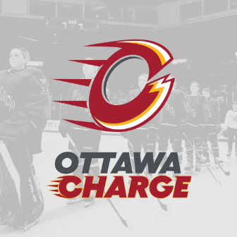
The Ottawa Charge’s name and logo reference the city’s history and fit in with its current sports landscape.
Name
Both a noun and a verb, the name Charge evokes movement– charging ahead, leading the charge– and energy– an electric charge. Movement and energy are great things to have associated with your sports franchise. Not a bad start.
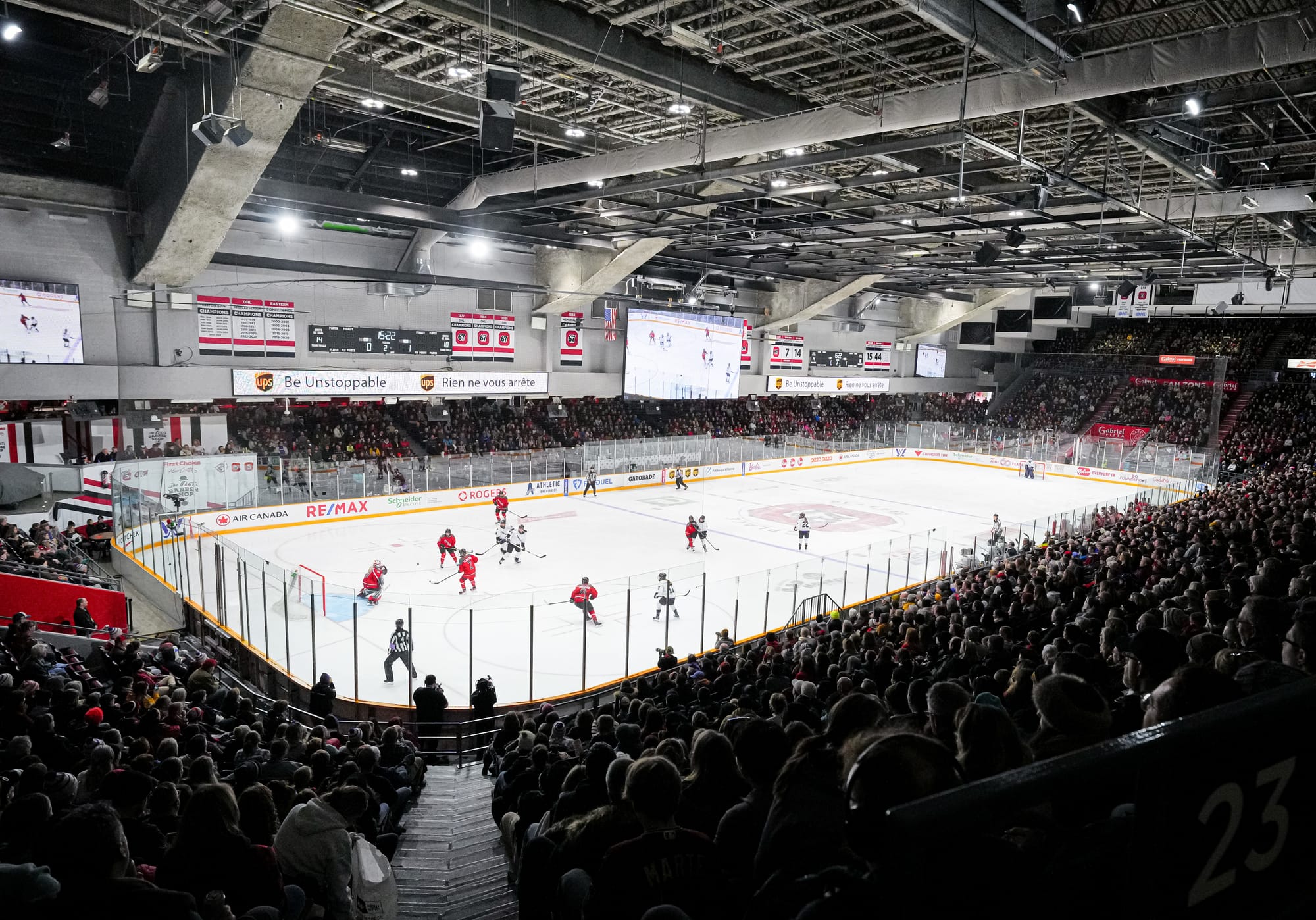
In explaining the team’s new names and identities upon release and in further exposition, the PWHL has referred to the energy and excitement that could be felt at Ottawa’s games during season one as inspiration for the name. While ‘our fans bring lots of energy’ is such a common saying in sports as to feel clichéd, Ottawa does have a special claim to it amongst PWHL teams. In season one, Ottawa had the highest average attendance in the league at a hair under 7,500 fans per game. TD Place Arena sits just over 8,500 fans for hockey, meaning that the stands filled most of their capacity for most games. That is a better environment for fan energy than other teams in the league could claim in season one, so they get a pass for the cliché.
As for one of the league’s stated goals in connecting the name to the city, one can point to the capital’s pioneering history in hydroelectric and nuclear energy generation– leading the charge for the charge, if you will.
As far as grading this name, it suffers for feeling a little too on the nose. On the other hand, while it may be slightly difficult conceptually to visualize ‘charge,’ the shorthand of a bolt of electricity is familiar and easy to translate into designs and animations, which the team has already taken advantage of:
It’s all in the details 🔥 pic.twitter.com/KHMZ1o3Kv6
— Ottawa Charge (@PWHL_Ottawa) November 8, 2024
Colors
As with the other PWHL color palettes, the Charge added a second color which brightens and deepens the color they used in season one. The red the Charge use is essentially the same shade as that of the Ottawa Redblacks, Ottawa 67s, and Ottawa Blackjacks, all of whom call TD Place home, which is pretty neat. The goldenrod the Charge added is essentially the same as that of the Ottawa University Braves.
Sharing colors with other local teams, particularly in a market that generally conforms to a specific palette, will go a long way to making the Charge feel like an Ottawa team. At the same time, no other team uses that red and the zippy goldenrod together, which means Charge merch will still be recognizably its own. The Ottawa Senators use a lighter and more saturated red and a secondary color closer to bronze than gold, so the branding ought to run parallel rather than match.

Logo
Professional sports teams in Ottawa tend to use an O as the basis of their logo, and why not? It’s a great shape for a logo and it directly references the city. The bonus for the Charge is that many of us who remember chemistry or physics classes may also associate circles with atom shells and the valence electrons that allow them to conduct electricity.
The Charge logo manages to contains a C as well as an O, which is not an easy feat; many an athlete or team or company has struggled to combine multiple letters into a visually pleasing logo.
Many Ottawan teams also utilize a rightwards orientation, which in the visual vernacular represents the future. Motion lines on the left of the Charge logo give it the impression of traveling (perhaps charging) to the right. These conveniently shear around the opening in the O/C shape that represents the C. The motion lines also echo the chariot wings of the Senators logo.

On said opening in the O/C shape, there is a small jagged section that suggests a lightning bolt shape. I would like to see more of this, as the logo itself conveys charge (forward motion) better than it does charge (electricity), and it doesn’t seem like it would be difficult to engage that element more deeply as well.
The Ottawa Charge’s logo does a lot of work: it fits both an O and a C; it carries elements that evoke electricity; it conveys ‘forward’ movement; it fits into the broader field of Ottawa sports logos while remaining recognizably its own.
Summary
Every element of this brand identity seems to have been designed to fit in with what professional sports teams in Ottawa look like. While some fans may prefer something that feels a little more original or unique, ‘Charge’ walks the line of familiar and fresh and gives a lot of room for future design work. And, relevantly in the current age of surprising new team names, it doesn’t distract in any way from the team itself by trying to do too much or go too far in some different direction.
It’s not my favorite identity, and it’s not my least favorite. It’s solid. It does what it intended to do. That is not a bad place to start from for a new team.