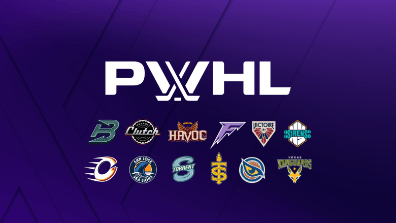
The PWHL officially unveiled the monikers and logos for the league’s newest teams, as announced Tuesday morning. The expansion franchises are the Detroit Clutch, the Hamilton Havoc, the Vegas Vanguards and the San Jose Sea Lions.
According to the league, “women-led PWHL design teams were at the helm of the process to develop each city’s brand identity.” The league collaborated with creative agency Doubleday and Cartwright for the logos on Vegas and San Jose.

Detroit Clutch
The Detroit Clutch team name and logo is an obvious reference to the city’s motor history. But in the same sense, ‘clutch’ in hockey has a different meaning – a player who is critical to the team’s success, who steps in when the moment is needed. I guess this makes Hilary Knight (presumably) Captain Clutch?
According to the PWHL, the name “reflects a city built by people who set ideas into motion, and a team who embraces the relentless pursuit of progress.” The logo and wordmark – in chrome – reference the automotive innovation of the city. The “rhythmic vinyl lines” sitting inside the wheel are intended to be reminiscent of a vinyl record, a tribute to Detroit’s Motown history.
My thoughts: I’m not surprised that Detroit went this way. It was pretty obvious from their clues on social media that the name would be somehow motor-related. Speculation included Clutch, Rev, Speed, etc. It certainly makes sense in both contexts of the word. I really appreciate that the logo includes a nod to the legacy of Motown, because that’s also an important part of Detroit’s history.
Hamilton Havoc
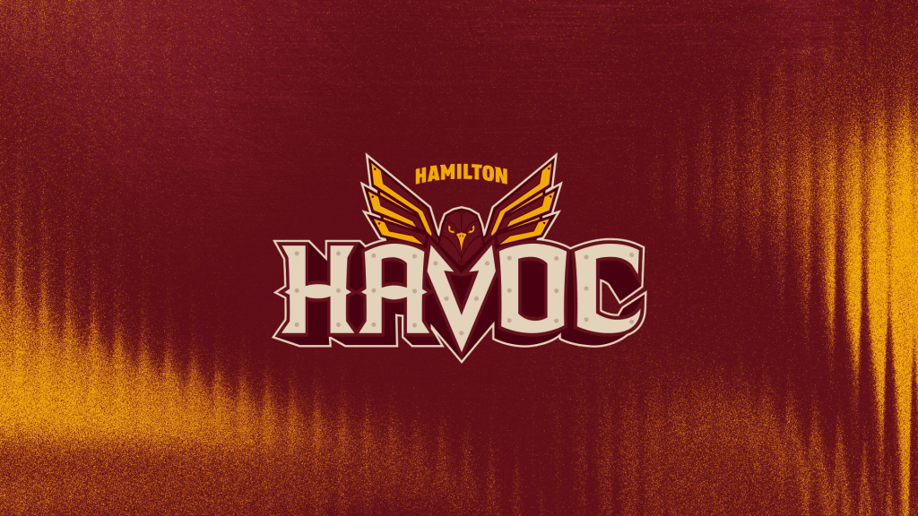
I wouldn’t have guessed this team name, but it’s an interesting one. According to the PWHL, the name “is inspired by the unique balance between the forces of industry and nature in Hamilton, as steel mills rise alongside the natural beauty of the Niagara Escarpment.” (I can personally vouch for this contrast. It’s truly stunning to drive through Hamilton and see both nature and all of the industrial buildings, some of which seem to constantly be pumping out fire/smoke.)
The logo includes the peregrine falcon, which is the official bird of Hamilton, reimagined in steel with ‘molten eyes.’ The lettering is intended to look steel-forged and riveted, to project “strength, durability, and unyielding resolve.”
The league’s press release notes: “shaped by generations of creators, builders, and makers, disruption has always made way for change, adaptation, and reinvention, and this team will be tested and forged in the same spirit.”
My thoughts: Okay, this is pretty cool. Like I said, I really wouldn’t have guessed this one. A lot of people thought it might be Forge, but since Hamilton already has a sports team with that name, there’s no way the PWHL would duplicate it. The logo has a lot of different components, but they all seem to work together well. The way the falcon seamlessly blends into the wordmark? Chef’s kiss.
(Note: there is another hockey team called the Havoc out there. The SPHL’s Huntsville Havoc play in Alabama. As long as the trademarks clear, I suppose there’s no harm in having two teams with the same name.)
Vegas Vanguards
Now we’re thinking outside the box!
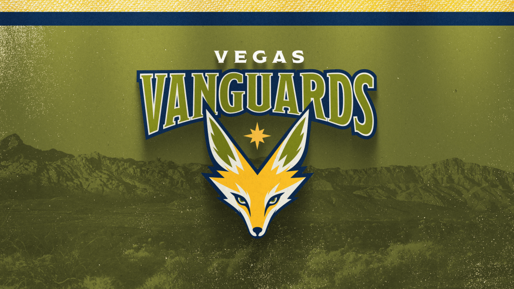
According to the league’s press release, this team name “celebrates those who lead the way, embracing challenges and creating new opportunities.” It’s inspired by the ‘pioneering spirit’ that helped shape the West, which is certainly appropriate for this expansion franchise.
The logo features the kit fox, which is native to the Mojave Desert. Las Vegas’ iconic star logo is also included, alongside a subtle ‘V’ silhouette tucked in between the wordmark and logo.
My thoughts: Grammatically, shouldn’t it just be ‘vanguard?’ Ah well. I’m not sure I really see how this one fits with the clues the team had given on social media. It’s a bit more abstract than the other team names. The fox is unique and particularly relevant to the deserts of Nevada, and the overall look makes me mind the color scheme less. (I wasn’t a huge fan of this shade of green initially.)
The inclusion of the iconic Las Vegas star is a nice touch. Honestly, I didn’t even notice the hidden ‘V’ silhouette at first, but it’s a nice way of wrapping everything together.
San Jose Sea Lions
This is perhaps the team name that was guessed the most by PWHL fans. It’s a nice touch to keep in line with the animal theme that other San Jose pro hockey teams have – the NHL’s Sharks and the AHL’s Barracuda. But it’s still different enough, especially with the team colors, that there’s no mistaking a direct connection.
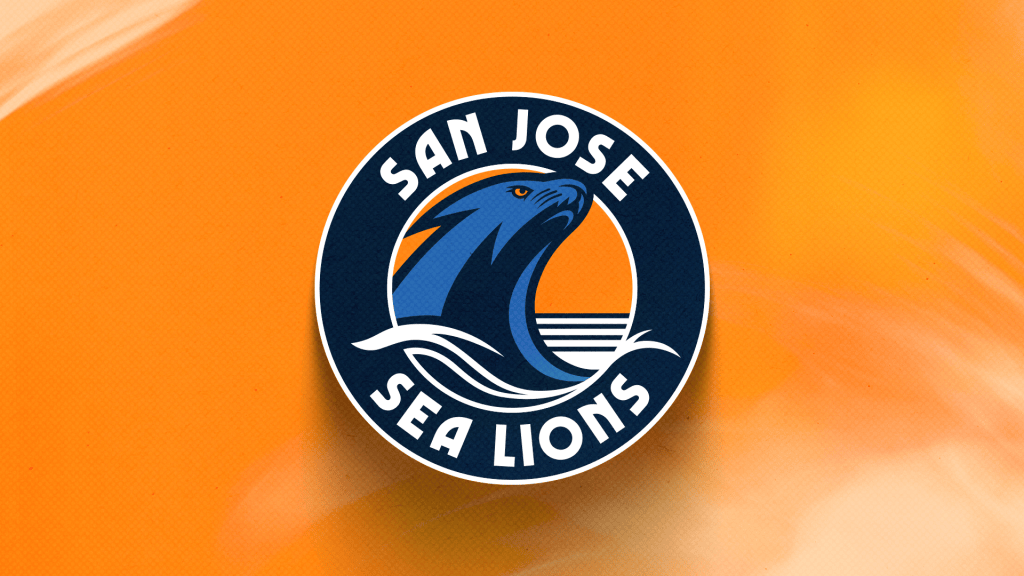
Sea lions are well-known in California, “known for their intelligence, playful expression, agility, and fierce protection of their colonies.” The details of the logo include clean, modern typography, the visual of a setting sun and also of an ocean wave. It feels like there’s a lot going on here, but it’s cohesive enough to not be overwhelming.
NHL fans can also reminisce about the California Golden Seals, but there’s other sports history to note here, too. According to the PWHL’s release, the name also connects to the former San Francisco Sea Lions of the West Coast Nego Baseball Association. That team featured Toni Stone, who was the first woman to play baseball regularly in a major men’s professional league.
My thoughts: This feels appropriately California without going too in-your-face. The sea lion in the logo (to me) actually also looks like an ocean wave, powerful and strong and ready to take over the shoreline. It’s modern, it’s clean, but it’s a strong identity. This team knows exactly who it is and who it’s representing.