During my eight years as a sportswriter I’ve found myself consistently drawn to a number of subjects, like Nordic hockey, social justice, and equity for non-cisgender athletes. I’ve also found myself fascinated by some choices in team logos.
Now, I’m not a graphic designer. I am, however, a big fan of committing to the bit. I like it when a team’s design department says “fuck it, we ball,” because sports are supposed to be fun and there’s no reason why its marketing can’t follow suit. With that in mind, I’ve compiled a list of five nifty hockey logos from around the world. I’ve also enlisted my colleague and jersey design aficionado LJ Bachenheimer for her unique takes. Let’s get into it.
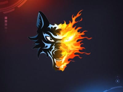
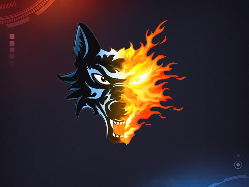
Team: Brûleurs de Loups (Grenoble)
League: FFHG Féminin Élite (France)
The Brûleurs de Loups logo, which Wikipedia tells me is French for ‘Wolf Burners’ (band name, called it), answers that famous question: ‘what if Ghost Rider was a wolf?’ Someone had an idea here and just ran with it, and honestly, I respect that.
LJ’s Take: I have to give the designer props for the concept, but there’s something off-putting about the actual logo. I think it’s the awkward transition between the wolf side and the flame side. It needs to be either straight half-wolf half-fire, or make the wolf in the fire even more subtle, like making the eye less visible or suggesting teeth. Still better than their previous logo, though, which looked like the Chicago Wolves got too close to a Bunsen burner.
Team: KH Wiedzmy 71 Wrocław
League: Tauron Liga Hokeja Kobiet (Poland)
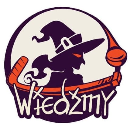
I love this. Considering the sexism still faced by plenty of female hockey players around the world, I adore naming a team after another historically-reviled female thing (‘Wiedzmy’ is Polish for ‘witches’). Graphically it’s everything I love about American Halloween aesthetics with a sleek and well thought-out finish. The witch’s profile being a solid color doesn’t turn her into a crone or a caricature and the glowing eye says she’s not to be messed with. The way the stick and puck arch together invokes a moon behind her, which is very appropriate for any witch. It’s fun, it’s cool, and as much as I love camp, I really appreciate how this isn’t camp. Well done.
LJ’s Take: I really enjoy the concept here, and the witch silhouette on a full moon is excellent. The witch herself is awesome, instantly recognizable without being over the top, with a sharp fierceness that really suits a sports team logo. However, this is a busy logo. The combination of the witch, the moon-like negative space, the hockey stick and puck, and the text is too much. I like the text treatment a lot and would love to see that as a website header or on a t-shirt, but it doesn’t work with the rest of the design. Take out the other elements and just let the witch be in a roundel logo with an orange outline and this would be perfect.
Team: Ratinger Ice Aliens
League: Germany3

Dear reader, have you ever thought to yourself that while hockey’s great and all, it really needs more extraterrestrials? Fear not! The Ratinger Ice Aliens are here to meet your highly specific need. This clear homage to H.R. Giger’s iconic Xenomorph shows a sleek smiling alien ready to put in 110% and play a full 60 minutes. The punch of red adds just the right amount of color while staying true to the creature’s classic greyscale palette. All in all cheesy yet fun.
Just a warning to our alien friend, though: chest-bursting is a game misconduct.
LJ’s Take: When Meredith sent this to me, I laughed out loud. It’s Alien meets Saturday morning cartoons meets hockey, and I cannot take it seriously. Why does it look like that? What’s going on with its eyes? What is that random red polygon?Why are the alien’s teeth sparkly? At that point, it should be missing a tooth to really sell the cartoon hockey vibes. I both hate it and love it in a “so bad it’s good” way.
Team: Seibu Princess Rabbits
League: Women’s Japan Ice Hockey League
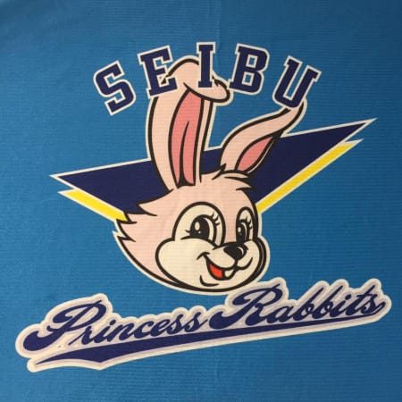
The Seibu Princess Rabbits are cult favorites here at The Ice Garden. The name is excellent and while the logo doesn’t quite live up to the name’s promise, there’s a certain early 1990’s Tiny Toon Adventures charm to it. For god’s sake, though, someone please get this rabbit a crown or a tiara or some kanzashi or something. She’s royalty.
LJ’s Take: The rabbit logo is adorable. I could totally imagine a full-costume mascot based on this design walking around an arena, or maybe a mall, which seems very in character for a team from Japan, with the country’s noted love of mascots. The text treatment here is kind of terrible, with the sporty block serif at the top and the varsity script at the bottom clashing in what seems to be an attempt at American sports aesthetics. Stick to one font or the other.
Team: Sydney Sirens
League: AWIHL (Australia)
I really enjoy the movement in this logo, and I love a team going for both mythology and alliteration. Considering that the lore around sirens portrays them as deadly creatures though, I do wish the mermaid had a more vicious edge to her. She is a creature to be feared.
LJ’s Take: I dig this. I kind of like the abstraction, with some nice motion to suggest a slapshot as well as that funky red and yellow swirl. I interpreted that as sound waves, perhaps to fit in with the mythology of sirens luring sailors to their deaths with song. To me, the shape of the figure’s upper body does suggest more manatee than mermaid, but manatees have been associated with mermaid folklore. And once again, I’m not a fan of the text. For one, I don’t like the font, and for two, it’s distracting. Save it for the website and other merch; get the wordmark off your main logo.