The New York Sirens may or may not have a strong visual and/or auditory identity.
Name
Mythological sirens are magical ocean beings whose music drives male sailors crazy, causing them to drive their boats to ruin on the sirens’ rocky homes. These talented and vicious hunters had women’s heads on the bodies of birds, and have also been associated with mermaids.
As a team name, fans of many sports have been interested in the power, violence, and visuals that such a name could infuse a team with. On the other hand, gendered names in women’s sports have a long and divisive history.
In the New York Sirens, the team has sidestepped both the potential controversy and the potential upsides of naming themselves after nautical murderers by completely ignoring the concept.
The New York Sirens are named after ‘the hum of the city.’ New York City, that is. Not to be confused with Connecticut, Long Island, or New Jersey: places where the team has actually played.
You will always hear us coming.
📰 https://t.co/SQqL9uDzK5 pic.twitter.com/AZtfsudBKi
— New York Sirens (@PWHL_NewYork) September 9, 2024
The auditory identity concept has a lot of potential in terms of things that the team could do with it in the future. Click on the link above to read a whole bunch of loud idioms that will undoubtedly get used on the team’s social media. They can also do a lot of visual things with the theme of sound:
Turning up the volume on our new logo animation 🗣️ pic.twitter.com/G5y67onXPd
— New York Sirens (@PWHL_NewYork) September 17, 2024
It will take some time for the auditory team theme to overpower the immediately present ‘murdering sailors’ visual that people may first imagine when they hear a women’s sports team is called the Sirens. There is also the fact that when people hear ‘New York Sirens, like the sound,’ the first thing they think of is probably the NYPD. That’s not going to make most locals think about cheering, particularly not at the current moment.
To its credit, the name Siren has a strong connection to hockey in the sense of a goal horn, or other auditory elements one might encounter at a hockey game. This element is included, with great effect, in the logo.
Logo
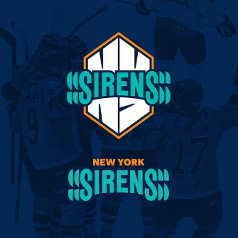
There are three main elements to the Sirens logo. The first is the word Sirens, in the team’s turquoise. There are slices of S on the outer edges that are meant to evoke sound waves. Behind that, there is the chunky NY, shaped in such a way as to represent New York architecture. The NY is rimmed with orange to emulate a goal horn.
The goal horn outline is great. There’s just enough burnt orange to set off the blue. I think the S slices surrounding ‘Sirens’ might be better as lines; the slices are visually distracting and also confusingly remind me of ocean waves, which they’re probably not supposed to. As described in the team’s logo explanation graphics, the chunky NY does bring to mind the International Style architecture of many of New York’s buildings. To me, the logos and wordmark are reminiscent of certain elements of the New York Giants and New York Knicks graphics design through the years.

It’s not a terrible logo. I find it visually appealing. But it starts with a massive disadvantage as it tries to visually represent an auditory concept and avoid a stronger word association.
At least the team is having fun with it:
Making the @PWHL_NewYork players draw their brand new logo in only a minute 😂
Which one was the best? 🤔👀 pic.twitter.com/wu4icroDiq
— Aliyah Funschelle (@AliyahFun) September 12, 2024
Colors
Although hockey fans may first think of the Islanders when they see orange and blue and hockey, many teams in the New York area have utilized the combination.

Orange and blue are complementary colors and the Sirens’ shades work well together, particularly when the blue takes prominence. The messaging about the color selection has been that it’s not meant to match with the New York Liberty or Gotham FC, and it’s not meant to match with the Islanders, and I believe that. It’s meant to say New York, the way all these teams and others have done. I don’t believe orange was chosen because it’s meant to say taxi or construction zone. Sorry.
What does say ‘taxi’ is the checker pattern the team is using on its graphics. Nailing the visual identity is going to be even more important for a team whose nickname is sound-based, and any additional graphic elements the team can develop and use consistently will help with that. The issue with the checker pattern specifically is that New York taxis have not used that motif since in 1999. While it may still be an association viewers will have with New York, it’s an odd choice from a design team that put so much emphasis on authentic connections to the places the teams will represent.
Summary
The design team clearly did some strong visual work to develop this concept. Unfortunately, they were fighting an uphill battle. I believe that the ‘Full Volume Hockey’ theme will catch on. I don’t know how much range it’ll have, how recognizable it can become outside of hockey-specific circles. Maybe if the team ever does play out of Long Island, as seems to have been the original intent, they’ll feel more comfortable bringing in the maritime imagery.
Until such a day, it feels very strange to have so much New York City flavor on a team that does not seem destined to play in Manhattan—or, for this season at least, in New York State at all. While there was likely no way to predict the team’s home arena for season two when the team identity was being conceptualized, at the moment, it feels very inauthentic to have this team’s identity being inspired by NYC. The ‘hustle, rhythm, and swagger of New York City’ concept is usable, but it is unlikely to resonate fully with fans cheering for their team in Newark, New Jersey.
At the moment, I rate the New York Sirens as one of the weakest team identities in the PWHL.